
Front-end developer pemula fokus perbaikan layout responsif, navbar, dan bug HTML/CSS. Siap mengerjakan micro-job cepat dan rapi
Yafidev (Yafidev)
Hire Me
Make a Private Project
Invite to Bid
Existing Projects
Make a Private Project
Invite to Bid
Existing Projects

| User Name: | Yafidev |
| Account Type: | Personal Account |
| Date Registered: | 14/12/2025 00:29:53 WIB |
| Last Seen: | 15/12/2025 15:50:18 WIB |
| Provinsi: | Jawa Tengah |
| Kabupaten: | Kab. Purbalingga |
| Website: | |
| Online Hours: | 0.50 |
| Projects Won: | 0 |
| Projects Completed: | 0 |
| Completion Rate | - |
| Projects Arbitrated: | 0 |
| Arbitration Rate | - |
| Current Projects: | 0 |
Ratings & Rankings
As Worker

0.00/10.00
0 Point
No Ranking
0 Projects
0.00/10.00
0 Point
No Ranking
0 Projects
As Owner
0.00/10.00
0 Point
No Ranking
0 Projects
0.00/10.00
0 Point
No Ranking
0 Projects
As Seller
0.00/10.00
0 Point
No Ranking
0 Sales
0.00/10.00
0 Point
No Ranking
0 Sales
As Affiliate
0.00/10.00
0 Point
No Ranking
0 Users
0.00/10.00
0 Point
No Ranking
0 Users
Services
No record found.
Products
No record found.
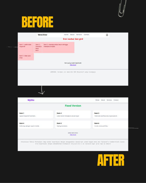
2025: This project focuses on fixing responsive layout and navigation issues on a website, especially on mobile devices.
The main goal was to improve the navbar behavior, ensure it remains visible and functional during scrolling, and resolve layout inconsistencies caused by responsive grid problems. I worked with HTML, Tailwind CSS, and vanilla JavaScript to adjust positioning, improve responsiveness, and handle mobile menu interactions more smoothly.
The result is a cleaner, more consistent layout with a responsive navbar that works properly across different screen sizes.
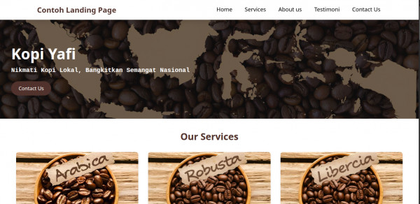
2025: This project is a responsive landing page designed for small businesses (UMKM).
The goal was to create a clean, lightweight, and mobile-friendly website using HTML and Tailwind CSS.
I focused on building a clear layout structure, responsive grid sections, and a simple navigation flow that works well on mobile, tablet, and desktop screens. The landing page is optimized for readability, fast loading, and easy content presentation for business needs
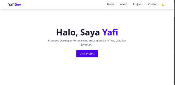
2025:
This project is a responsive portfolio website built with HTML, Tailwind CSS, and vanilla JavaScript.
The focus was on creating a clean, lightweight, and mobile-first layout with a fixed responsive navbar and flexible grid system. I resolved common front-end issues such as broken mobile navigation, layout misalignment on small screens, and scroll behavior bugs when opening the mobile menu.
The result is a fast-loading website that works consistently across mobile, tablet, and desktop devices.
No record found.
No record found.
Anda harus login terlebih dahulu untuk melihat data ini.
You must login first to see this data.
 Loading ...