
I am a branding and graphic design specialist. I specialize in packaging design, trademark creation, naming, and company style.?So far, I?have completed over 1000 projects for the Russian, American, Bulgarian and other European markets. I have won dozens of contests, including some based on real consumer reactions to packaging designs by different studios. My experience with and insight into customer preferences in various countries has greatly helped me to produce highly innovative designs for a wide variety of products.??
Victor Ankov (ModernWorld_Studio)
Hire Me
Make a Private Project
Invite to Bid
Existing Projects
Make a Private Project
Invite to Bid
Existing Projects

| User Name: | ModernWorld_Studio |
| Account Type: | Personal Account |
| Date Registered: | 20/06/2024 14:59:21 WIB |
| Last Seen: | 19/09/2024 14:29:03 WIB |
| Provinsi: | |
| Kabupaten: | |
| Website: | https://mws-branding.com/en/about |
| Online Hours: | -13.01 |
| Projects Won: | 0 |
| Projects Completed: | 0 |
| Completion Rate | - |
| Projects Arbitrated: | 0 |
| Arbitration Rate | - |
| Current Projects: | 0 |
Ratings & Rankings
As Worker

0.00/10.00
0 Point
No Ranking
0 Projects
0.00/10.00
0 Point
No Ranking
0 Projects
As Owner
0.00/10.00
0 Point
No Ranking
0 Projects
0.00/10.00
0 Point
No Ranking
0 Projects
As Seller
0.00/10.00
0 Point
No Ranking
0 Sales
0.00/10.00
0 Point
No Ranking
0 Sales
As Affiliate
0.00/10.00
0 Point
No Ranking
0 Users
0.00/10.00
0 Point
No Ranking
0 Users
Services
No record found.
Products
No record found.
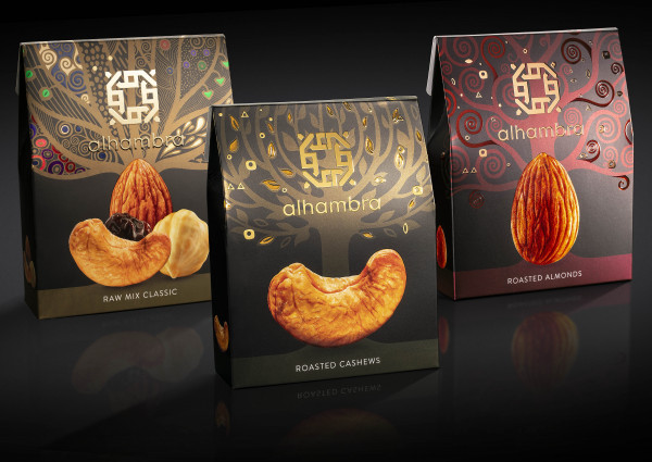
2022: THE TASK
The goal of this project was to create a really opulent packet of nuts for a specialist store that only sells limited-edition premium items. In addition to the creative design executions, the package includes intricate typographic printing to improve the project's visual effect. This is demonstrated in the project's accompanying film.
THE SOLUTION
The project's concept is based on a philosophical interpretation of the Tree of Life. The Tree of Life is responsible for all living creatures on the planet's interconnectedness and serves as a metaphor for a common evolutionary genesis - from a little nut containing the necessary elements for the emergence of life through the entire development of a big tree. The nut contains a blueprint for the future tree's development.
The processes of vital activity within are sluggish and barely noticeable when it is small and at rest, but once you find yourself in a nurturing environment, these processes are awakened, and a miracle of rapid growth starts to materialize. - the birth of life - occurs. I intended to express the idea that each nut contains a hidden remarkable energy through the use of intricate design elements used within the project. These elements combined with our powerful illustrations help us unveil the inherent potential of each nut and its unique inner essence.
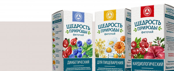
2023: Behind the success of this project is a very long legal packaging design. The work assigned to us is for a series of seven types of medicinal tea of the brand "The Bounty of Nature". The line is sold in pharmacies and is great for the prevention and treatment of a number of conditions.
a common concept was the focus in this project which created a stylish packaging design, the protagonist of which is the main ingredient of each type of tea. The watercolor drawings occupy a large surface of the packaging.
Laconic flower fields with strict and pure colors diversify the types of tea and are a reference to the main component in the composition. Mandatory texts displayed at the bottom of the packaging - they are clear and concise, organized on a blue fash, so that there is one spot, standing on the shelf and immediately recognized by the consumer that it is a series.
The design, based on original drawings, adds value to the product and makes it increasingly popular among both merchants and customers. The "Nature's Bounty" tea series receives excellent reviews, thanks to both its qualities and the packaging design.
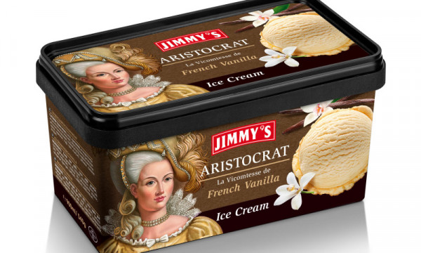
2024: The task
An ice cream manufacturer in Bulgaria, JIMMY`S, approached me with a request to make a �revolutionary� packaging design.
Execution
The client chose an idea that had not previously been offered in the ice cream segment - the idea of aristocrats. The naming of the project, all the characters, as well as the execution of the idea - everything was developed from scratch.
The key element of the packaging design line, responsible for the formation of emotional contact with the consumer, are characters - aristocrats. For each of them, I came up with a title associated with the taste of ice cream - this is how French, English and Spanish aristocrats appeared
The Illustrations
The illustrators studied the costumes and hairstyles of the 18th century, which were drawn in great detail.
For the food zone, real photos of ice cream were used. Photographing ice cream is not an easy task. it constantly melts. After shooting, the photos were then carefully retouched and put into the project.
Another important element of the packaging design is the deep background, emphasizing the aristocracy of the entire project.
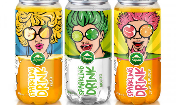
2024: The idea & task
A series of carbonated drinks for the producer from Armenia � Sipan. When creating this project I had to remember that the drinks are targeted towards a younger audience, which greatly boosted the creative freedom. The sparkling extravaganza of the fruit in synchronization with the bright and almost animated characters are right in your face. I really wanted to reinforce that our main characters in this design love fruits, enjoying themselves and partying. With all the combinations of colours, emotions and freshness thoughtfully displayed in the design of each drink. For each individual can a character has been created tailored to each taste, from Tarragon, to Mango & passion fruit and Pear. The main themes of the colours are clearly displayed, providing a vivid idea of what they exactly convey, while the fonts are bold and very easily readable, assuring that the brand stays fresh in customers� minds.
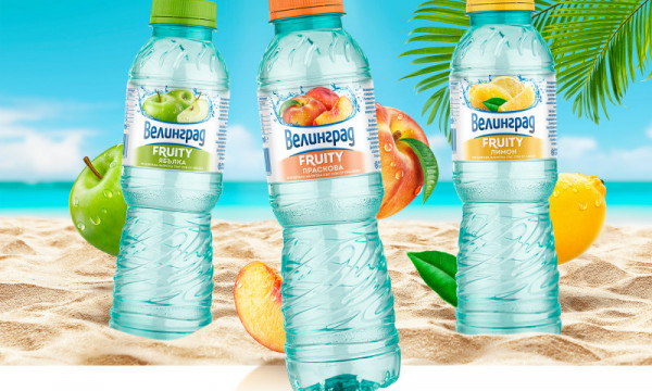
2024: A client - Tymbark Bulgaria approached me with a task to design a series of VELINGRAD drinks with the sub-brand Fruity, with a fruity flavor. This drink is developed for people who do not like plain water and prefer to drink fruit water. I have developed a concept and design of three types. On the label, the fruits are depicted according to the taste of the drink and a water splash. The design maintained continuity, with the VELINGRAD company logo still preserved on the packaging, already known to customers from the plain water. Thanks to the unified style, the line of drinks with different flavors looks harmonious.
No record found.
No record found.
Anda harus login terlebih dahulu untuk melihat data ini.
You must login first to see this data.
 Loading ...